SHAPING THE JUSTCO BRAND EXPERIENCE
Brand Refresh
A Unified Visual Language
JustCo's brand refresh was a foundational project, impacting all subsequent design initiatives. The goal was not only to modernize and unify the brand's visual identity, ensuring consistency across all regional markets and communication channels, but also to instill a strong sense of place that would connect members with their workspace.
Brand Guidelines Development
A comprehensive brand guidebook was created to ensure consistent application of the brand identity across all touchpoints for the 6 markets in Asia Pacific.
-
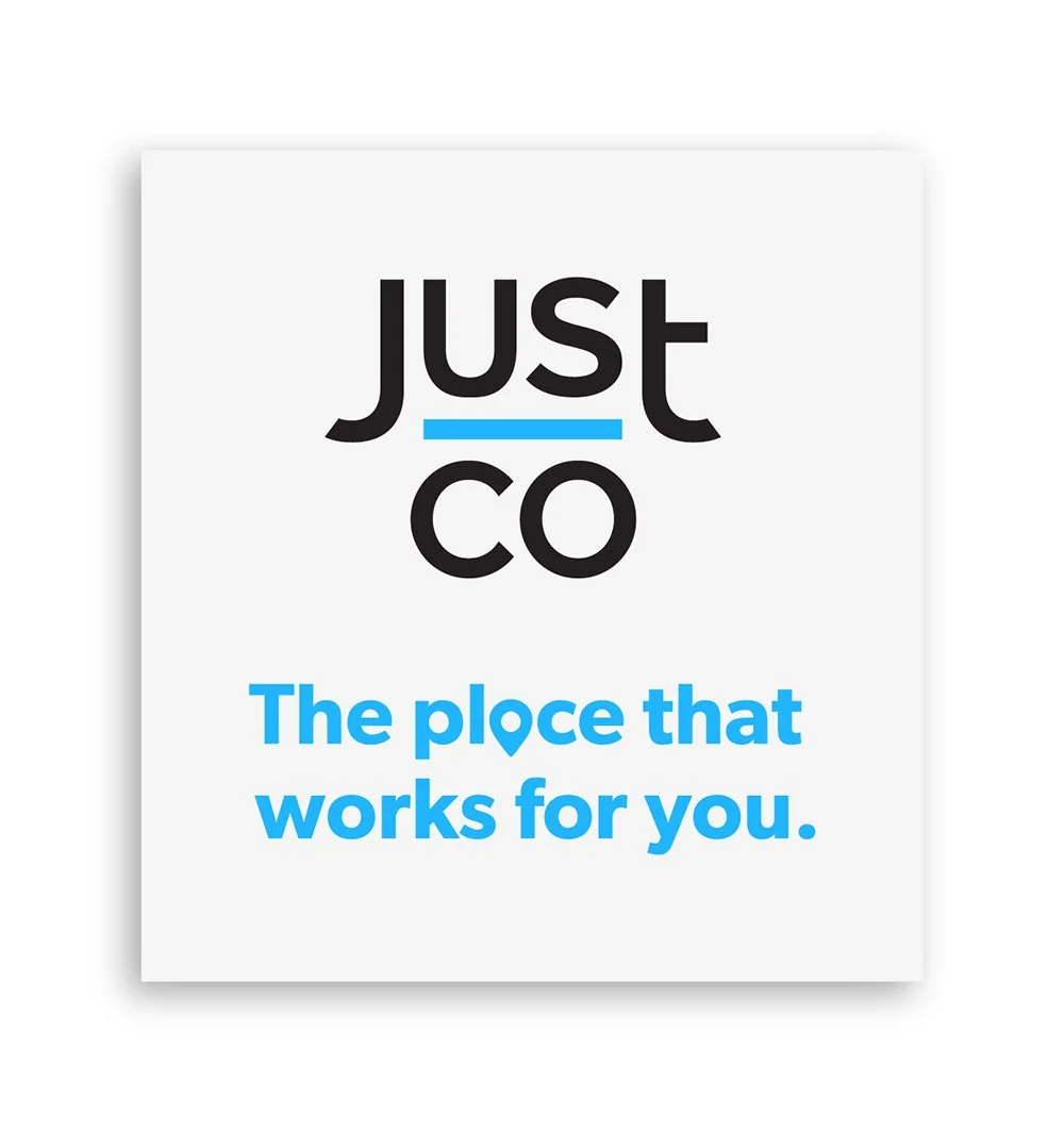
Subtle updates to the logo – A fresh paint of JustCo Blue on the bar to enhance its impact, while identifying it as a key brand asset.
-
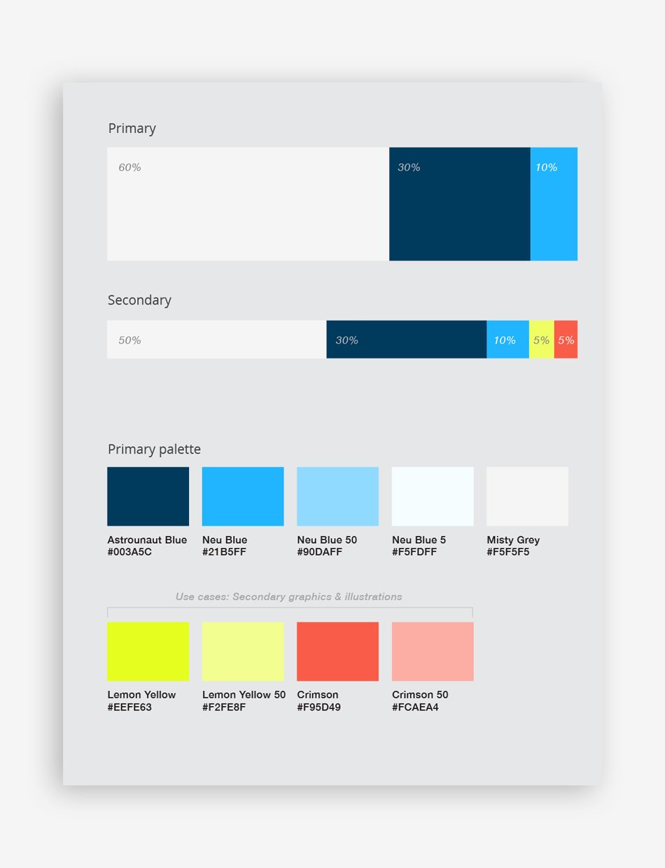
Developing a vibrant and versatile color palette that reflects JustCo's dynamic and community-focused culture
-
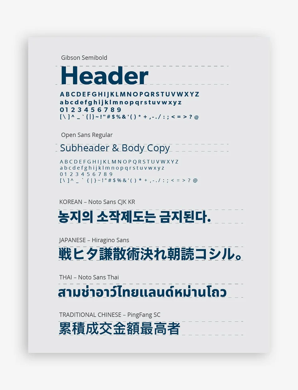
Establishing a clear typographic hierarchy and selecting typefaces that convey professionalism and modernity.
Logo refinement
Colour palette expansion
Typography system
Brand Positioning:
A Collaborative Vision
-
The creation of JustCo's brand positioning, "The Place That Works For You," was a deeply collaborative process. Working closely with the brand squad, we explored a wide range of ideas, engaging in open discussions and creative problem-solving.
This iterative approach, fueled by diverse perspectives, ultimately led us to a powerful statement that resonates with our target audience and defines the JustCo experience. "The Place That Works For You" now serves as the central theme for all our campaigns, ensuring a unified brand message.
-
The Place That Works For You –
More than a mere a catch phrase; it's the embodiment of JustCo's commitment to fostering a genuine sense of place. We recognized that a workspace is more than just desks and chairs; it's a community, an ecosystem, a place where individuals and businesses connect, collaborate, and thrive.
By crafting a positioning that emphasizes this sense of place, we aim to forge a deeper connection with our members. We want them to feel a strong sense of belonging, a sense that JustCo is their place—a place where they feel supported, inspired, and empowered to do their best work.
This connection, this feeling of ownership and community, is what sets JustCo apart. It's what transforms a shared workspace into a vibrant hub, a preferred destination for businesses seeking more than just an office—a place where they seed and grow their aspirations.
By creating this emotional bond, we solidify JustCo's position as the preferred coworking brand, not just for today, but for the future.
-
Each localized identity incorporates elements that represent the city's unique character, further emphasizing its sense of place and creating a deeper connection with our members.
This commitment to fostering a sense of place extends beyond our overarching brand positioning. Recognizing the unique character of each market we serve, I developed a localized identity system for six key regions: Singapore, Australia (Sydney and Melbourne), Taiwan, Thailand, Korea, and Japan.
These aren't simply translations of the tagline; they are carefully crafted adaptations that resonate with the specific cultural context and visual landscape of each city. Each localized identity incorporates elements that represent the city's unique character, further emphasizing its sense of place and creating a deeper connection with our members.
This localized approach is woven throughout the member journey, from initial touchpoints like digital advertising and website content to the design of our physical workspaces and community events. By celebrating local identity within the larger JustCo brand, we reinforce the message that "The Place That Works For You" is not just a global promise, but a deeply personal and locally relevant experience.
JustCo staff lanyard
JustCo staff access card


