SHAPING THE JUSTCO BRAND EXPERIENCE
Website Redesign
Case Study: UX-Driven Website Redesign
The redesign of JustCoGlobal.com was a significant undertaking, initiated by stakeholders to address the need for increased lead generation and improved conversion rates. Our goal was to create a best-in-class online experience for prospective and current JustCo members. By implementing UI/UX best practices throughout the redesign, we had successfully achieved a 10% increase in user engagement.
These were our challenges:
-
Balancing visual appeal with website performance and accessibility.
Simplifying complex information architecture for improved navigation.
Integrating diverse content types (e.g. blog posts, testimonials) seamlessly.
Ensuring responsiveness across various devices and screen sizes.
Maintaining brand consistency with the updated brand positioning.
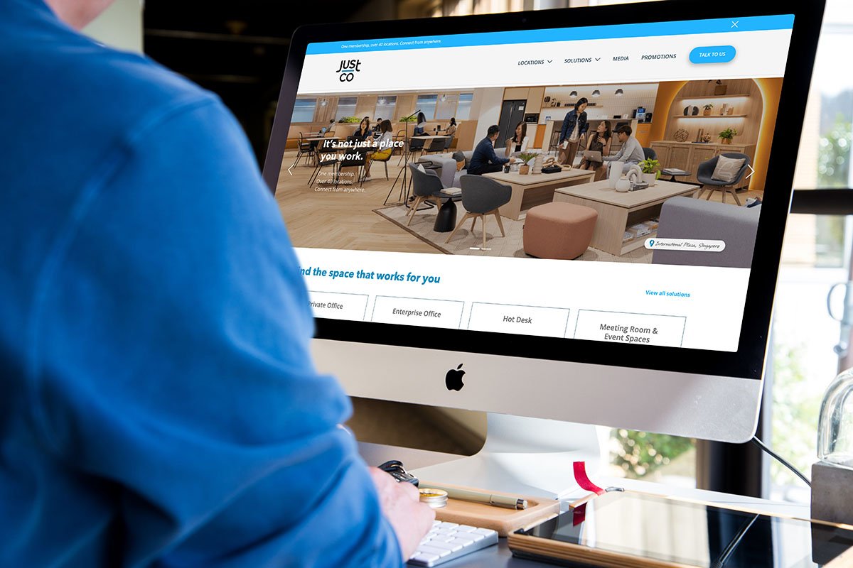
Before the facelift
Design Process
1. Discovery & Research
A comprehensive competitive analysis was conducted to evaluate the online presence of other flexible workspace providers in the Asia Pacific region. This involved analyzing their websites, marketing materials, and overall brand positioning.
Key areas of focus:
-
Examining how competitors organized their website content and the ease of navigation for users. This revealed best practices in information architecture and helped us identify opportunities to simplify and improve JustCo's site navigation.
-
Analyzing the overall user experience and visual design of competitor websites, including layout, typography, imagery, and interactive elements.
This provided inspiration for design trends and helped us identify areas where JustCo could differentiate itself visually.
The discovery phase was crucial for understanding the user landscape and validating our design direction. A comprehensive approach, encompassing a site audit, benchmarking, user research, and competitive analysis, revealed key patterns and themes. This research provided a solid foundation for the design process, eliminating guesswork.
This process allowed me to leverage my UX skills to identify key areas for improvement and prioritize features that would deliver the most value to users. Discovery was not a sprint, but rather an iterative process that continued to inform our decisions throughout the project.
A site audit and competitor analysis allowed us to identify and prioritise features that would deliver the most value to users.
-
Low-fidelity wireframes served as the blueprint for the website's structure and functionality. These quick sketches and diagrams allowed us to focus on the core functionality and user experience without the distraction of visual design elements. This approach facilitated efficient communication within the team and with stakeholders, making it easier to gather feedback and iterate on the design. The benefits of using low-fidelity wireframes included:
Faster Iteration: Changes and adjustments could be made quickly and easily, accelerating the design process.
Focus on Functionality: The emphasis on layout and user flow allowed us to prioritize functionality over aesthetics.
Improved Communication: Wireframes served as a clear communication tool, facilitating discussions about design decisions.
Cost-Effectiveness: Creating low-fidelity wireframes is a relatively quick and inexpensive process, saving time and resources.
2. Structuring the Experience
A visual sitemap – the information architecture on JustCoGlobal.com/SG
The improvements implemented:
-
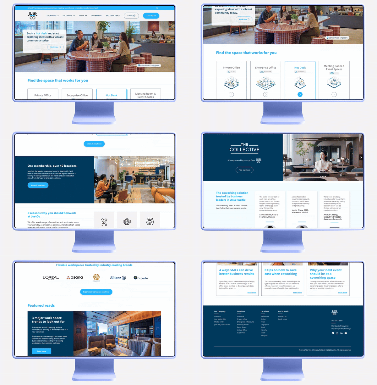
A detailed analysis of the information hierarchy informed the design of a navigation menu that significantly improved website usability, catering to the needs of JustCo's target audience while supporting key business goals.
-
A dedicated promo card was strategically placed above the fold to maximize visibility for current promotions and campaigns, ensuring immediate user awareness.
-
JustCo's core products were prominently featured, significantly reducing the time and effort required for users to find the information they needed, creating a more seamless and efficient user experience.
-
Integrating Testimonials:
To build trust and credibility, and to showcase the positive experiences of JustCo members, we strategically integrated a dedicated testimonial section. The placement of the testimonial section was carefully considered to maximize visibility and impact, influencing conversion and building confidence in the JustCo brand.
-
To enhance user engagement and drive organic traffic, we introduced a "Featured Reads" section showcasing a curated selection of JustCo's blog articles and other relevant content. This section serves to provides users with access to informative and engaging content, encouraging users to explore the website further, increasing time on site and engagement. The inclusion of relevant and keyword-rich blog articles also significantly improves the site's SEO ranking.
3. Bringing it to Life
Visual Design & Prototyping
With the wireframes as a foundation, I developed the visual design for the website, ensuring consistency with JustCo's refreshed brand identity and creating a modern, engaging aesthetic. This included:
-
Creating high-fidelity mockups to showcase the visual design and user interface.
-
Developing interactive prototypes to simulate the user experience and test the website's usability.
-
Creating a design system to ensure consistency and scalability across the website.
4. Testing & continuous iteration
We gathered feedback on the website's usability and identified areas for improvement. This iterative approach allowed me to refine the design based on real user feedback.
Even after the launch of the site, we continued to monitor and iterate on the design to ensure that the website continues to meet the needs of the users and achieve its business objectives.


